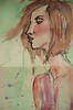
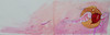
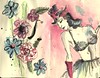
It's been a little minute since i could just sketch. I took advantage of the time i had last night waiting for my haircolor timer to go off by sketching some photos out of a mag i found. I actually really like the looseness of this one....i gotta get better at profile lips...mine suck. but i couldn't be more pleased with the messiness and splatters...this one was a fun spread to do
Wednesday, December 30, 2009
Tuesday, November 10, 2009
 my sneak peeks for Gina...these are detail shots of what I've done in her journal, "color your days", so far...
follow along at http://confettiisfun.blogspot.com/
Monday, October 26, 2009
Enter At Your Own Risk
 part of my journal exchange I'm doing with Gina...you can follow along over at http://www.confettiisfun.blogspot.com/
Sunday, October 11, 2009
Dreams & Nightmares Sign-In page
 so this is the Sign-In page for my art journal exchange... I've added a bit more detail since I photographed this, so it'll still be a surprise when Gina gets this. I'll post the rest of the pages after I know she has it, so she'll have a few complete surprises when she opens the book! Follow along at http://www.confettiisfun.blogspot.com/
Tuesday, October 06, 2009
Someone's Watching Me
 Here's a detail shot of the inside cover page of my Moley that I'm going to be trading with Gina. I picked the theme Dreams & Nightmares for mine. I have plans for the 1st few pages, and then I was thinking i might start some backgrounds on a few random pages, so we can collaborate on some pages together. This is a large watercolor Moley...I almost used a little one, but I think it would be easier for me to work larger to start with. Once I finish the rest of my starting pages, and Gina gets it in the snail mail, I'll post the rest of the pages, and the full opening cover of this spread. I'm glad I picked this particular theme....so many ways to illustrate this! Gina and I will be blogging our exchange on confettiisfun.blogspot.com if you'd like to follow along!
 Monday, August 17, 2009
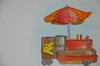
Lucky Dog
i am fascinated by the Lucky Dog carts, and I want to paint hundreds of pictures of them. I don't know why. anyway, did this out in Jackson Square in the French quarter...getting a feel for the watercolors.... i've got a couple ideas for some mixed media pieces with the Lucky Dog cart!
This one got kind of muddy and overworked, but what the hey...it's my sketchbook afterall, and if you can't overwork something in there, where can you? LOL
This one got kind of muddy and overworked, but what the hey...it's my sketchbook afterall, and if you can't overwork something in there, where can you? LOL
Sunday, August 16, 2009
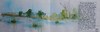
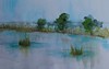
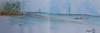
Fontainbleu State Park Marsh
here's the full page.. i like this sketchbook i'm working in for this one... it's a keeper! the pages hardly buckle at all, and blieve me, i'm not one to use the water sparingly!!! plus i like the long landscape spreads....
detail of my marsh page
i like this one.... it's my 1st landscape with watercolors, i think, but i do still like it... i can't wait to learn more and try more techniques to get it even better!
Lakefront
one of my sketches from my long distance sketch crawl with my friend Gina
i kind of wish i hadn't used that ink in this one, but, i guess it's alright. i'm still working out landscapes and watercolor...
i kind of wish i hadn't used that ink in this one, but, i guess it's alright. i'm still working out landscapes and watercolor...
Gazebo Cafe band
This guy moved around a lot!!! i tried to be as quick as possible sketching him, but I definitely need more practice with that!
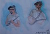
Gazebo Cafe band 2
trying to get out and sketch around town when i can. This is one of the members of a very cool blues band that plays at Gazebo Cafe over in the French Quarter. Sketching the band made for a nice lunch...
My new Holbein watercolors in blues and browns worked perfectly for this sketch!
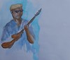
My new Holbein watercolors in blues and browns worked perfectly for this sketch!
Thursday, August 13, 2009
back online
finally got a new computer! yay! working from the phone is impossibe. as soon as i finish hooking the scanner and stuff back up, i'll be good to go....but 1st the speakers, so i can have a little music....
Monday, July 27, 2009
Sunday, June 21, 2009
O*P*I Doodle

I just started a new job, and some days are super quiet, so during those slow times, i'm trying to doodle. This little polish was sitting on the register, so I sketched it and colored it at home.
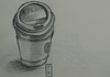
Washbucket

This was an example in the book "Painting Weathered Buildings in Pen, Ink & Watercolor" by Claudia Nice. The book is really great...especially since I love all things rusty and crusty! ; ) I would liked to have a little bit more value range, but I didn't want to keep putting more layers and make it muddy.
Sunday, May 17, 2009
Geronimo

This is for one of my groups on flickr. They post a photo to use as a reference and everybody posts their versions of it. Love it! They post some really random pics so far! LOL!
Mixed Media in one of my hand*book journals.....
Wednesday, May 06, 2009
St Louis Cathedral Mary
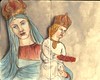
I figured out i have enough photos of different Virgin Mary statuary to fill a couple Moleys, so here is Mary Moley #1! I love religious iconography as much as i love my pin-ups.
This Mary statue is in one of the entrance doors to the St Louis Cathedral in NOLA
I almost think the background needs a little more grunge...like the "ink." page....maybe i'll journal on each page a little about each individual piece or about symbolism used for Mary and whatnot...
ink.
this one is in the pin-up studies moley. I like the grungy background...it adds a little bit of extra interest to me. The brown charcoal pencil works well on the moley paper.

Saturday, May 02, 2009
Mardi Gras
24"x24" mixed media on canvas
available for purchase....
will be available at Element Salon or contact me directly....
available for purchase....
will be available at Element Salon or contact me directly....
Monday, April 27, 2009
Michelle Obama
There's a group on flickr that posts a photo to use as reference for you to paint. The 1st one was a photo of Michelle Obama, so I thought I'd give it a shot. I did this pretty quickly, so I like the loosness of it. I don't know how much it really looks like her, but i still like it, either way! ; )
watercolor and ink in my hand*book journal.
watercolor and ink in my hand*book journal.
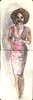
Pin-Up Study #15
Mixed Media in my Pin-Up Moleskine. I got a little grungier with the background on this one, and I really like how that came out! I'd like a little bit more realism in the facial features, but i rather like this loose style. These little studies are really helping me learn the human figure and helping me figure out a painting style.
Thursday, April 23, 2009
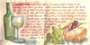
Wine & Cheese
Decided to paint my lunch today....I've seen so many cool journal pages about food that inspire me, I thought i'd try my hand at it.
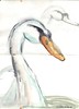
Swan
page 3....one of the lovely swans. They move around a lot, so it was bit tricky to catch this one, but i do like the looseness of the sketch! For a 1st timer to sketching "live" i learned a lot, and I am completely hooked. I will still take my photographs to use for reference for some other artwork, but I will definitely be a sketcher outdoors from now on! I probably would have sketched over by this lake a little longer, but this really hateful little goose kept running and snapping at everyone out there. He did that last time, too. He's like a crotchety hateful old man...stupid goose! I have photos of him...he will get a full spread at some point, but maybe not from life....i don't want that mean thing to bite me. LOL!
City Park, NOLA
City Park, NOLA
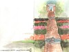
Lord and Taylor Rose Garden
page 2 of the "New Orleans" journal. This is my 1st journal where i have actually sketched and painted on site.
The rose garden is really amazing. 2 fountains in the path, and then another hige fountain and statue off to the side. The amount of different roses is really astounding! And the colors.....breathtaking, to say the least!
City Park Botanical Gardens, NOLA
The rose garden is really amazing. 2 fountains in the path, and then another hige fountain and statue off to the side. The amount of different roses is really astounding! And the colors.....breathtaking, to say the least!
City Park Botanical Gardens, NOLA
Covered Walkway
page 1 of the new "New Orleans" journal I started today. This is my 1st journal where I have actually sketched and painted on site, so i really enjoyed my day!
City Park Botanical Gardens, NOLA

City Park Botanical Gardens, NOLA
Saturday, April 18, 2009
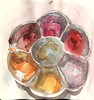
Ceramic Palette
i almost got all the shadows right to make it look like it has depth, so i'm pretty stoked about that, because the shadows were a lot harder to paint than expected. this is my fave-o gouache ceramic palette....awesome Talen's gold in the center, with some Daler-Rowney, W&N, and M. Graham pinks, oranges and reds all around. i need to get another one for my blues greens and purples i guess. this is my nifty little square hand*book journal....maybe my favorite one....maybe
Friday, April 17, 2009
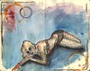
Take Flight...
i'll probably add some sort of quote to this later, but for now i can't decide which one. i also like it for a possible tattoo design...hmmmm....
watercolor, gouache and ink in my hand*book journal
watercolor, gouache and ink in my hand*book journal
Monday, April 13, 2009
Pin-Up Study #14-Peter Driben
i went back to pencil for this one...wasn't quite sure if i could pull off that cute little wink in straight pen-not yet anyway! ; )
I love these Moleskines, however, the watercolor does bleed through, which it does not do in my hand*book journals, so that'll be a thought for my next one. I haven't tried out the watercolor Moleskines with any regularity yet, so that may be an option over the sketchbook. The pantyhose looked like a much warmer toned black in the book, so i'm thinking i should have mixed some umber watercolor in with the black? hmmm... haven't quite grasped the warms and cools of watercolors yet, or how much lighter they dry...but i am learning, so it's all a matter of time.
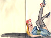
I love these Moleskines, however, the watercolor does bleed through, which it does not do in my hand*book journals, so that'll be a thought for my next one. I haven't tried out the watercolor Moleskines with any regularity yet, so that may be an option over the sketchbook. The pantyhose looked like a much warmer toned black in the book, so i'm thinking i should have mixed some umber watercolor in with the black? hmmm... haven't quite grasped the warms and cools of watercolors yet, or how much lighter they dry...but i am learning, so it's all a matter of time.
Friday, April 10, 2009
Pin-Up Study 13(a & b)
The Smith's sang a song called "Some Girls Are Bigger Than Others" ...well, some pages are better than others. but you have to make a lot of junk to learn how to make something good, so i don't mind my junk pages. (too much)
this is 2 attempts at drawing the same picture in pen...realllyyy missing my pencil and ERASER! ; ) but , indeed there are bits on each that i like, and i see where the big mistakes are, so i learned, and that's what counts.
the good thing about messing up is that you can just let go completely and try things you wouldn't normally, since "it's already messed up anywho", and then sometimes your boo-boo, no matter how badly misproportioned, still makes you say "cool!" ; )
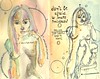
Pin-Up Studies 11 & 12
another sketch of Dita Von Teese and one from Playboy Blondes.
i am trying to sketch in pen rather than pencil. it's hard to break pencil-drawing habits! i know the correct proportions will come the more i draw, so i'm not worried so much about that. i like the looseness of the marks i make with the pen. this pin-up moley is all about playing and learning, so i do no expect "perfect" pages. i expect lerning and new ideas and fun. still trying to figure out the watercolor, but i am enjoying playing, good color combinations or no! ; )
i like the rapidograph a little more than i like the micron 005...i don't know why. they pretty much the same. i felt like the micron was a little more fragile though.(probably because i wore it out so quickly!)
even though it's messy, i like the addition of the lettering in this page, and i'll probably add more of that to future pages.
Thursday, April 09, 2009
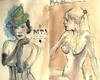
Pin-Up Study #10
April's issue of Inked magazine had some great photos of Dita Von Teese in it that i couldn't resist trying to draw in pen. ahhhh, pen....with no eraser. It's quick and sorta messy, but i like the colors, and it has loads of possibilities for something a bit more refined later...
I got a new rapidograph pen today, and wanted to try that out. I used to draw with one years ago, but my barrel on it cracked, and for some reason i just never bothered to replace it. it sketches quite nicely in the moleskine sketchbook...it drags a little on my other sketchbooks. Instead of gouache, I used watercolors on this one...a mix of my DS and my Holbeins. they bleed through the pages a little more than the gouache, but i think that's just me using too much water.
the left side of the spread started as an attempt to draw one of the other photographs, but it was super craptastic, so i did a little boo-boo fixer upper with some crazy flowers! i don't mind them so much...it adds to the circusy bordello flair of the colors! ; )
Tuesday, April 07, 2009
Coffee Bar...
a sketch in my art journal...having lots of fun with my watercolors. the DS Kyanite that i used in parts of the coffee pot are VERY sparkly...awesome!
in a side note...i had used all the memory on my computer(it's super old) and so, being the rocket scientist i am, decided to clear me up some space by deleting programs i never use....apparently somehow how i deleted the crappy but workable editing program for my pictures. awesome. now i can't crop or chage the file size...nothing. yayyyyy me! LOL anywho, so for now it all will be posted from flicker, so that at least the picture will fit on the screen.

in a side note...i had used all the memory on my computer(it's super old) and so, being the rocket scientist i am, decided to clear me up some space by deleting programs i never use....apparently somehow how i deleted the crappy but workable editing program for my pictures. awesome. now i can't crop or chage the file size...nothing. yayyyyy me! LOL anywho, so for now it all will be posted from flicker, so that at least the picture will fit on the screen.
Friday, April 03, 2009
Dream....
playing around with my watercolors, i just started looking at the shapes the puddles of color made, and i traced around this cute little cloud, and then used white gouache to highlight it....
square hand*book journal

square hand*book journal
Sculptures in NOMA, City Park
The 3rd floor of NOMA is the Asian, Oceanic, African, and Native American Art....it might be my favorite part of the museum. Some of the walls are painted the most gorgeous shade of aqua blue, so it's very peaceful up there. SOOOOOO much cool stuff to look at!
This is done with my cool NEXUS pens. I've had them for a bit, but never really put them to use, so I thought i'd give them a try...plus, i found an aqua one at Dixie the other day, and had to have it. It may be my new favorite pen! AND they don't bleed when you put a watercolor wash over them...good stuff! I really enjoyed sketching in just ink without doing a pencil sketch 1st. It makes you draw a bit differently though....i'll definitely be doing more pen-only sketches! ; )
square hand*book journal
Spider, City Park Sculpture Garden
this giant spider is in the sculpture garden in City Park. It's all spindly and crazy looking...I did get a photo, so I'll have to upload it. There were a ton of other cool sculptures in there that I can't wait to go back and sketch.....would have sketched all day, but the rain forced us inside. That's ok, though...there was plenty to sketch in there, too! ; ) I used my very cool NEXUS pens for this one. I don't think it shows up very well in this scan, but i found a very cool aqua one the other day at Dixie...I should have bought like 3 more of that one, because I'll use all the ink out of that in a quick minute! I love it!
square hand*book journal
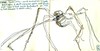
square hand*book journal
Monday, March 30, 2009
Flowers....

...would brighten the day of your close friend. That was the fortune in my cookie yesterday, so i just had to put it on this postcard. This is on the way to friend.....
Sunday, March 29, 2009

Shhhh....

TA-DA!!!!! Here she is, all finished! I think i really like how she turned out. and getting there, while scary, was also fun! and i used supplies i totally didn't plan on, so the end result was a very unexpected surprise. I still have a few angles on the face i'd like to perfect for the next painting, but it'll get there, and today was definitley another hard lesson in patience....and in letting go. all in all i really enjoyed the process, and would like to do a few more pieces this way, but with maybe a little less charcoal muck....perhaps i'll perfect the drawing on paper and then transfer it to canvas. but maybe not...that oil pastel is brilliant against charcoal mucky-muck.... ; )
Shhhh.... Stage 5

Holy Dead Corpse Bride, Batman! what have I done! Yes, i fixed the angles of her nose and eyes, but now she's just creeptastic Now it occurs to me to take a break, it couldn't have been BEFORE i recreated an autopsy scene with her face......I really didn't know if it was fixable. I had to remind myself that it didn't matter, that i WAS JUST PLAYING....
and then....cha-ching! I remembered my oil pastels!!!! and thought how much fun they would be to play with...that i might get some interesting textures.....
and i did! ; )
Shhhh.... Stage 4

Here I added that same lavendar i had originally painted the background with to the sash, neckline, and wings. I like how these colors go together, a lot. I also added some raw sienna and burnt umber glazes to her to make it more dimensional. Here's where i should have stopped to review the pictures and taken a step back for a minute. the face was not totally horrific here. the neckline is at a much more graceful angle, and it's still relatively unmucked with charcoal dirt. but, alas. I am very impatient. .....
Shhhh.... Stage 3

Hmmm, the face is not so bad...Here I added a bright tangerine glaze to the upper right and lower left corners, topped that with a glaze of my Irr. Antique Copper, and another layer of the tangerine glaze. I also added some white glaze highlights to her arms dress and hair, and right along the profile of her face. Added a very thin bit of the copper glaze to the wings to try and bring back some depth.
Shhhh....Stage 2

I have such a hard time with this face angle. I am really going to have to keep practicing it, and not in willow charcoal. This stage I added a glaze of my Irr. Antique Copper mixed with a raspberry color to the background, and a white glaze to the wings.I did try to redo the face....a few more times! LOL fix. fix. fix. repair. repair. repair. LOL i do like the wings so far though...
Shhhh.... Stage 1

So, today I decided to just let go and play. I started with a canvas i had painted a lavendery violet, covered with sewing pattern tissue, and then added a wash of liquitex's Irridescent Antique Copper, which apparently they've stopped making. I'm quite pissed about that actually, because it's my favorite color to mix with purples and violety pinks. I have been trying to find a similar replacement color, but no such luck yet. They're all way too orange...this was neutraly brown, almost rosy. It's hard to explain, but it was perfect, so of course now it's gone. Anywho. so I took my willow charcoal and just sketched a quick angel. ugh...she's crappy. she does get better. and then worse. and then, i think, better again. anyway, it's all about playing today! and, fyi. if you've never photographed your progress, it's quite eye opening. I wish i had looked at my photos at each stage before i continued....there are some things that i thought i had done wrong, but looked ok in the photograph, but of course i had already tried to cover over my boo-boo's. NEVER A GOOD IDEA WHEN USING CHARCOAL>>>IT JUST GETS SUPER MUCKY!
Friday, March 27, 2009
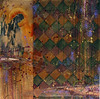
Carnivale
I have struggled with this piece for such a long time, but I think i'm finally happy with the results....I was trying to force a lot of things to come out of it, and trying to force different elements to work together, so I had to leave it alone for a good while simply because i wanted to chuck it in the trash, but now I think I have it it in a better, grungier place, which is what I wanted in the 1st place. I started it in painting class, and my goal was to feature voodoo as part of the cemetery culture here in NOLA, but at the suggestion of my teacher to include architectural elements, I got lost.... This is Carnivale...the pattern in the left top corner is the voodoo veve(or symbol) for this, and i tried to make it reminiscent of the porch decorations so prominent in NOLA. The angel is a sculpture in one of our cemeteries, and the repeated circles represent dubloons, which are left at alters honoring Carnivale....I am also working on another piece that's part of this series.......hopefully i won't struggle with that one as much now that I've let go a little! ; )
Wednesday, March 25, 2009
Hot! Hot! Hot!
I haven't done any still lifes in a while, and I am really teaching myself watercolor, so this was an interesting page to work on. I am so impatient...i really need to wait until some layers dry before i add other washes of color....but i'm learning! ; ) Glass is a hard thing to paint.....so many reflections and shadows...
These are 2 of my favorite hot sauces(i have several)...the Cholula is great on eggs, and the Louisiana Hot Sauce is good on everything, especially red beans and rice!
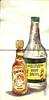
These are 2 of my favorite hot sauces(i have several)...the Cholula is great on eggs, and the Louisiana Hot Sauce is good on everything, especially red beans and rice!
Tuesday, March 24, 2009
Strawberries and Crawfish

Spring in NOLA....the absolute best time for local food....crawfish, shrimp, oysters, strawberries. yummmmm! I couldn't resist trying to paint part of my dinner tonight....the colors were absolutely amazing and vibrant! I definitely feel like I could use a lot more practice capturing the colors in watercolor, but hey, who could complain? Extra practice means more seafood and strawberries to use for reference...LOL! I could eat this stuff every day! and definitely, the hotter, the better! I can't wait to draw some more tomorrow! ; ) perhaps some hot sauce?.....
The Aldige Angels


I used a photograph of one of my favorite statuary pieces for this journal page. It memorializes a mother and daughter that drowned in a steamboat accident back in 1848. The base of the sculpture is a boat. I especially love the emotion on the faces in the sculpture. Eventually I'll do a large painting using this sculpture.
Monday, March 09, 2009
a new journal page....

another page using a photo i took in one of the NOLA cemeteries.....I LOVE how this one turned out! I don't know about mixing the Derwent watersoluble pencils with the watercolors....it may be making the drawings look too dirty, which is totally weird for me to say, since i love grungy looking pages...this combo may just be grungy in a not so good way. but good at least for this page! i love the colors...... this is sure to become a bigger painting......
Angel journal page
 So I have been working on some larger pieces, and also doing a little more photography lately, and my posts have fallen by the wayside. I did this spread just to start messing with my watercolors..... the colors didn't scan very well. But i like the grunginess of how it turned out....i just like grungy things...and i keep doodling this angel(it's one of my photographs, but i keep grabbing this particular photo out of the pile every time...i must reallllllly like it! LOL) This is in my square hand*book journal....
Subscribe to:
Posts (Atom)