Monday, March 30, 2009

Flowers....


...would brighten the day of your close friend. That was the fortune in my cookie yesterday, so i just had to put it on this postcard. This is on the way to friend.....

Sunday, March 29, 2009

Shhhh....detail


here's a little bit closer shot so you can see the cool textures....

Shhhh....


TA-DA!!!!! Here she is, all finished! I think i really like how she turned out. and getting there, while scary, was also fun! and i used supplies i totally didn't plan on, so the end result was a very unexpected surprise. I still have a few angles on the face i'd like to perfect for the next painting, but it'll get there, and today was definitley another hard lesson in patience....and in letting go. all in all i really enjoyed the process, and would like to do a few more pieces this way, but with maybe a little less charcoal muck....perhaps i'll perfect the drawing on paper and then transfer it to canvas. but maybe not...that oil pastel is brilliant against charcoal mucky-muck.... ; )

Shhhh.... Stage 5


Holy Dead Corpse Bride, Batman! what have I done! Yes, i fixed the angles of her nose and eyes, but now she's just creeptastic Now it occurs to me to take a break, it couldn't have been BEFORE i recreated an autopsy scene with her face......I really didn't know if it was fixable. I had to remind myself that it didn't matter, that i WAS JUST PLAYING....
and then....cha-ching! I remembered my oil pastels!!!! and thought how much fun they would be to play with...that i might get some interesting textures.....
and i did! ; )

Shhhh.... Stage 4


Here I added that same lavendar i had originally painted the background with to the sash, neckline, and wings. I like how these colors go together, a lot. I also added some raw sienna and burnt umber glazes to her to make it more dimensional. Here's where i should have stopped to review the pictures and taken a step back for a minute. the face was not totally horrific here. the neckline is at a much more graceful angle, and it's still relatively unmucked with charcoal dirt. but, alas. I am very impatient. .....

Shhhh.... Stage 3


Hmmm, the face is not so bad...Here I added a bright tangerine glaze to the upper right and lower left corners, topped that with a glaze of my Irr. Antique Copper, and another layer of the tangerine glaze. I also added some white glaze highlights to her arms dress and hair, and right along the profile of her face. Added a very thin bit of the copper glaze to the wings to try and bring back some depth.

Shhhh....Stage 2


I have such a hard time with this face angle. I am really going to have to keep practicing it, and not in willow charcoal. This stage I added a glaze of my Irr. Antique Copper mixed with a raspberry color to the background, and a white glaze to the wings.I did try to redo the face....a few more times! LOL fix. fix. fix. repair. repair. repair. LOL i do like the wings so far though...

Shhhh.... Stage 1


So, today I decided to just let go and play. I started with a canvas i had painted a lavendery violet, covered with sewing pattern tissue, and then added a wash of liquitex's Irridescent Antique Copper, which apparently they've stopped making. I'm quite pissed about that actually, because it's my favorite color to mix with purples and violety pinks. I have been trying to find a similar replacement color, but no such luck yet. They're all way too orange...this was neutraly brown, almost rosy. It's hard to explain, but it was perfect, so of course now it's gone. Anywho. so I took my willow charcoal and just sketched a quick angel. ugh...she's crappy. she does get better. and then worse. and then, i think, better again. anyway, it's all about playing today! and, fyi. if you've never photographed your progress, it's quite eye opening. I wish i had looked at my photos at each stage before i continued....there are some things that i thought i had done wrong, but looked ok in the photograph, but of course i had already tried to cover over my boo-boo's. NEVER A GOOD IDEA WHEN USING CHARCOAL>>>IT JUST GETS SUPER MUCKY!

Friday, March 27, 2009

Carnivale

Carnivale
Carnivale,
originally uploaded by GlitzInk.
I have struggled with this piece for such a long time, but I think i'm finally happy with the results....I was trying to force a lot of things to come out of it, and trying to force different elements to work together, so I had to leave it alone for a good while simply because i wanted to chuck it in the trash, but now I think I have it it in a better, grungier place, which is what I wanted in the 1st place. I started it in painting class, and my goal was to feature voodoo as part of the cemetery culture here in NOLA, but at the suggestion of my teacher to include architectural elements, I got lost.... This is Carnivale...the pattern in the left top corner is the voodoo veve(or symbol) for this, and i tried to make it reminiscent of the porch decorations so prominent in NOLA. The angel is a sculpture in one of our cemeteries, and the repeated circles represent dubloons, which are left at alters honoring Carnivale....I am also working on another piece that's part of this series.......hopefully i won't struggle with that one as much now that I've let go a little! ; )

Wednesday, March 25, 2009

Hot! Hot! Hot!

Hot! Hot! Hot!
Hot! Hot! Hot!,
originally uploaded by GlitzInk.
I haven't done any still lifes in a while, and I am really teaching myself watercolor, so this was an interesting page to work on. I am so impatient...i really need to wait until some layers dry before i add other washes of color....but i'm learning! ; ) Glass is a hard thing to paint.....so many reflections and shadows...

These are 2 of my favorite hot sauces(i have several)...the Cholula is great on eggs, and the Louisiana Hot Sauce is good on everything, especially red beans and rice!

Tuesday, March 24, 2009

Strawberries and Crawfish


Spring in NOLA....the absolute best time for local food....crawfish, shrimp, oysters, strawberries. yummmmm! I couldn't resist trying to paint part of my dinner tonight....the colors were absolutely amazing and vibrant! I definitely feel like I could use a lot more practice capturing the colors in watercolor, but hey, who could complain? Extra practice means more seafood and strawberries to use for reference...LOL! I could eat this stuff every day! and definitely, the hotter, the better! I can't wait to draw some more tomorrow! ; ) perhaps some hot sauce?.....

The Aldige Angels


I used a photograph of one of my favorite statuary pieces for this journal page. It memorializes a mother and daughter that drowned in a steamboat accident back in 1848. The base of the sculpture is a boat. I especially love the emotion on the faces in the sculpture. Eventually I'll do a large painting using this sculpture.

Monday, March 09, 2009

a new journal page....


another page using a photo i took in one of the NOLA cemeteries.....I LOVE how this one turned out! I don't know about mixing the Derwent watersoluble pencils with the watercolors....it may be making the drawings look too dirty, which is totally weird for me to say, since i love grungy looking pages...this combo may just be grungy in a not so good way. but good at least for this page! i love the colors...... this is sure to become a bigger painting......

Angel journal page

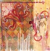
So I have been working on some larger pieces, and also doing a little more photography lately, and my posts have fallen by the wayside. I did this spread just to start messing with my watercolors..... the colors didn't scan very well. But i like the grunginess of how it turned out....i just like grungy things...and i keep doodling this angel(it's one of my photographs, but i keep grabbing this particular photo out of the pile every time...i must reallllllly like it! LOL) This is in my square hand*book journal....